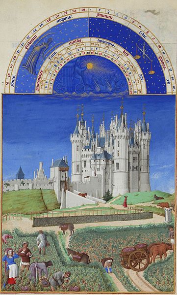
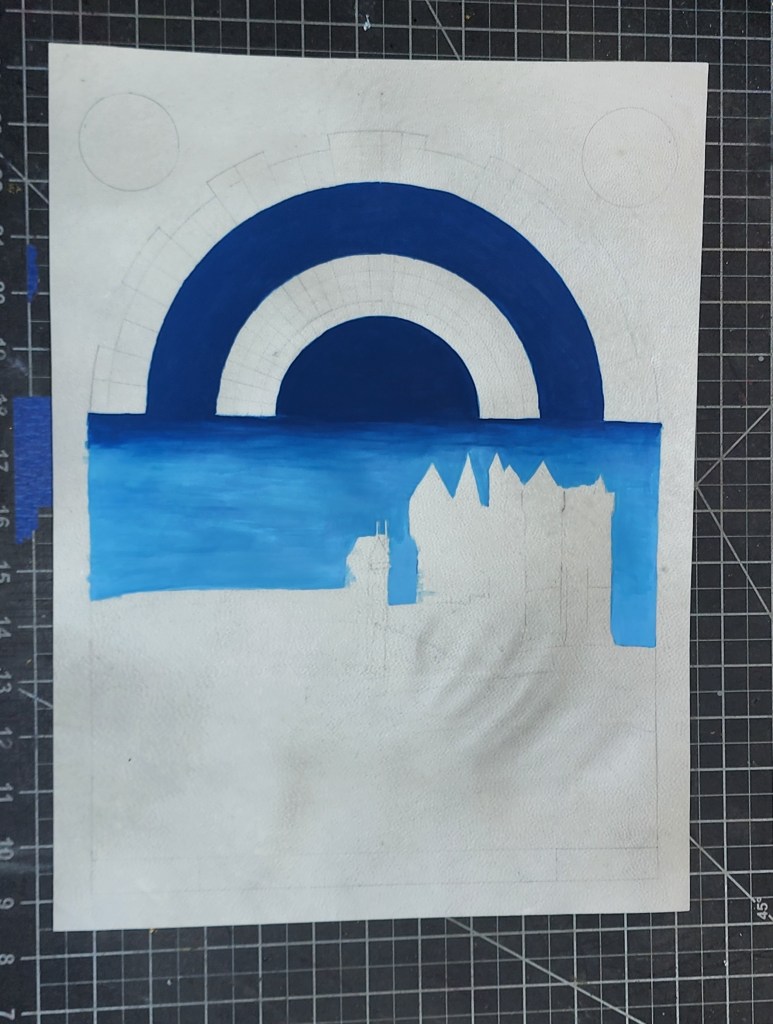
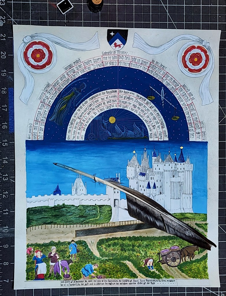
Inspiration – Per recipient’s request: Inspiration Très Riches Heures du Duc de Berry C early 1400. , “September- Chateau d Saumur” (completed 1485 by Jean Colombe)
Materials: hide vellum, period and natural pigments, gum arabic binder, gold leaf. Calligraphy being iron gall ink applied via quill.
Goals for assignment:
1) Request of recipient: “This image is very special for me.” – match appearance, style, mood and ‘presence’ as best as possible, add elements to match award expectations
2) Use of pigments to match colors and application techniques as closely as possible.
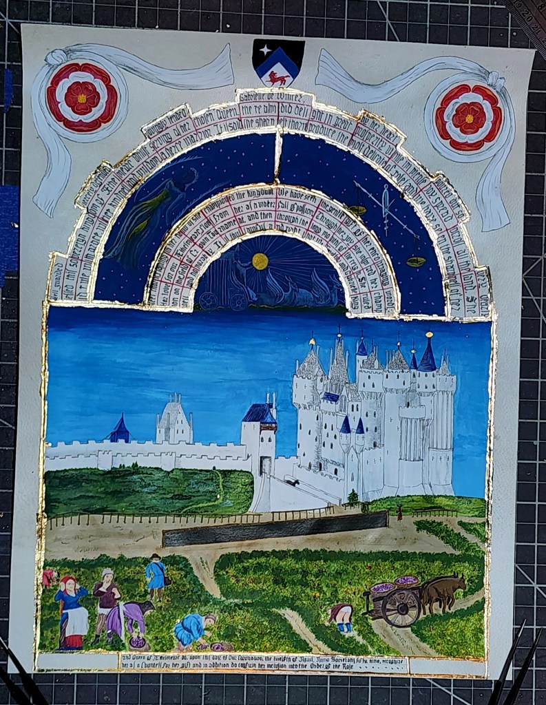
3) Continue practice gilding techniques. Limited use of gold in original – match application, factor design of coronet along arches.
4) Calligraphy with Iron Gall ink, apply with quill. Size diminishing from outside-in to match perspective.
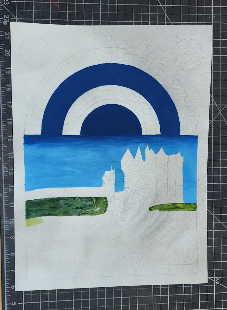
This commission require great departure from comfort zone. Design presented challenge. Original limited for verbiage space, liberty taken to maintain “style” while necessary sacrifice to calendar overall. Outside ring of text reworked to form embattlements of County Coronet for achievement. Balance of page left open upper corners, decision to fill with Roses enwreathed of White Scarves for meaning to recipient. Personal Arms direct center above, ends of white scarves imiate mantling frequently seen in Peerage scrolls. Choice intentional: Keep center image of carriage, griffons and sun duplicating original; change to which would alter overal appearance of main image.
Variances of blue requiring several shading mixtures of pigments. Application being difficult to prevent re-activating previous layers. Quick, light strokes necessary, working in many layers one over other. Unable to achieve secondary base tint to left (under Virgo) on a uniform base, decision made: keep with deeper ultramarine for consistent background color. Lesson learned for future: need better brushes for wide swaths and more consistent mixing of lighter pigments. More blending practice. Time of essence, and limited times available per session hindered greatly. Methods and techniques require working within-session, specifially for large background areas or when color consistency necessary.
Calligraphy choice forced perspective. Result, nice idea, not as nice execution. Future lesson – cut down on verbiage, keep with original style for overall feel. Vellum resisted ink, requiring slow application of lines. Different cadence of ink application – one dip, one stroke, repeat. Overall, found this cadence good- will likely maintain as force of habit. Ink more consistent from quill, even with resistance from Vellum. Choice to put lower banner on bottom necessary for verbiage, could have leveraged to balance letters more.
Result: many improvement options. Many victory conditions. Overall image replication achieved, perspective of period artist made interesting study. Management of workshop atmospheric greatly help. Most important, Recipient indicates happy.
Verbiage:
Well Guarded, fiercely defended, lovingly tended, Gabrielle De Winter by her heart poured out so very deeply blessed this sovereign Kingdom of Aethelmearc while serving as her chosen Queen, the realm did delight in great prosperity while immense joy spread across all the land. She did rule with grace, justice kindness and wisdom; a fierce warrior. It is said the sharpest thorns produce the most delicateroses and we have seen the sharpness of her steel thorns flashing in her hands as she championed the Kingdom. We have seen the gentle gift of her encouraging words. Her love for our Aethelmearc flows from her as a waterfall of passion. Through her joy she inspired her champion on the field of Crown Tournament, and then through the long months of the reign she ruled well and Honorably. It is thus lawful and right that, We, Timothy and Gabrielle, King and Queen of Aethelmearc do, upon this day of Our Coronation, the twelfth of April, Anno Societatis fifty nine, Recognize her as a countess for her gift, and in addition do confirm her inclusion into the Order of the Rose.