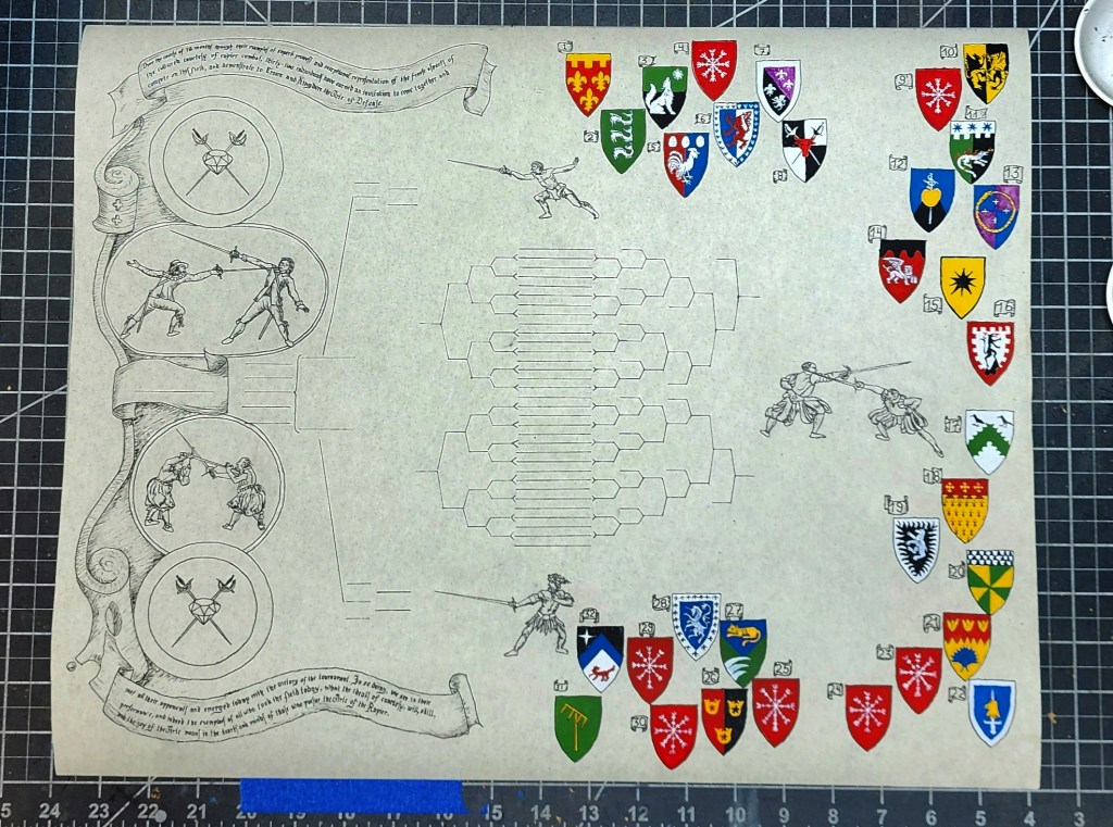
Tournament Victory Scroll assignment for Garnet and Steel Tournament.
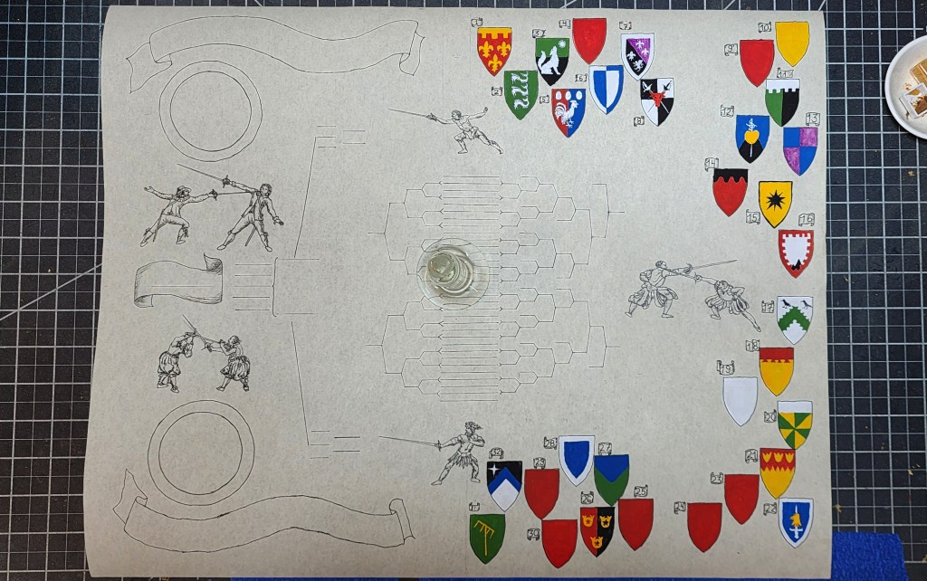
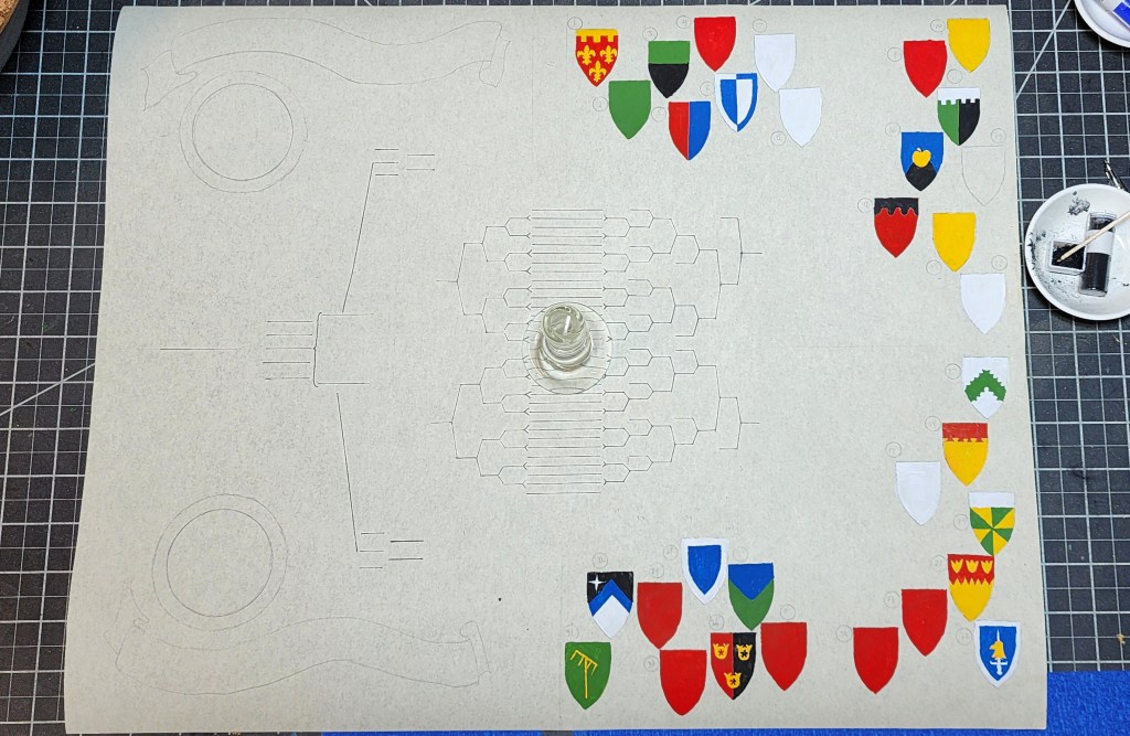
Being having little detail for requirements, only 1) needing have heraldry for entrants and 2) being the Double-elimination list, interpretation being open.
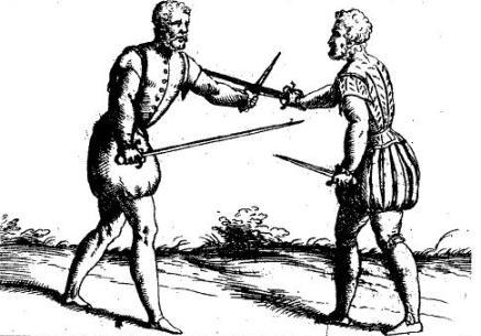
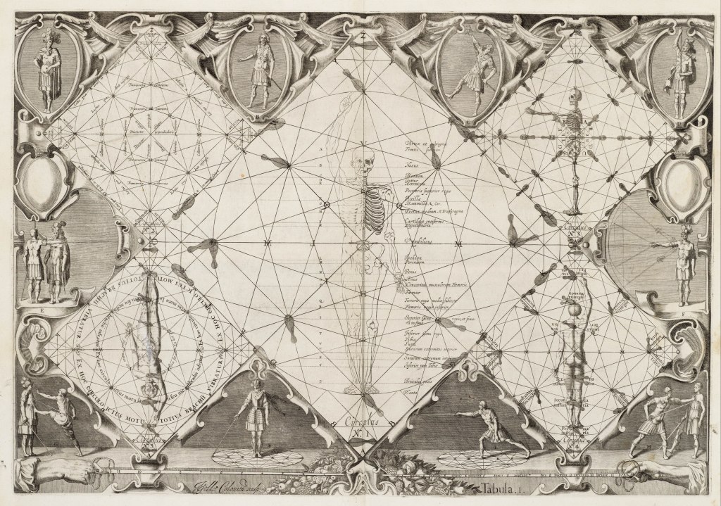
Long talk with Patron giving idea. Likely being too obscure for noticing, but liking anyway. Design incorporating heraldic display in one side, other side being appearance designed from pages in Rapier Manuals. Concepts being transition from studied knowledge of Rapier foundation, transitioning across page through double-elimination list to display SCA heraldry of participants, illustrating through transition the way students of Rapier take document of learnings and transition into martially effective techniques in modern SCA context. Each student does so by own way, and so not specific style chosen to be specifically representation. Each Heraldic image has number associated with earned coin and invitation. List tree in middle representing central aspect in demonstration, being contest of person to person, skill to skill, learning to learning and honor to honor. Verbiage articulating tournament genesis and core values of Arte of Defense.
Reading thus-specifically being Patron’s words.
“Over the course of eighteen months, through their examples of superb prowess and exceptional representation of the finest aspects of the Cultured courtesy of Rapier combat, thirty two individuals have earned an invitation to come together and compete on this field, and demonstrate to Crown and Kingdom the ideals of the Arte of Defense.
(name)
met all their opponents and emerged today with the victory of the tournament. In so doing, we see in their performance, and indeed the exemplars of everyone who took this field today, what the ideals of courtesy, skill, will, and the joy of the Arte means in the hearts and minds of those who pursue the Art of the Rapier. “
Patron content with effort. Final details filling in on day when pairings and contest happening.
Follow-on notes: Seeing muchly things working on could be improve. Being second attempt at line/woodcut, aware better designing important. Art style presentation being aesthetic unfamiliar, struggling for balance. Overall concept of presentation masking issue, but issue remaining. Possible asking for future effort in style for more practicing. Hand for calligraphy not accurate for style, but choosing intentional. Block printing for manuals looking dull, and hand used being more SCA-aesthetic expectation. Banners being too dynamic in shape, future efforts being more linear and smooth in style.


Leave a comment